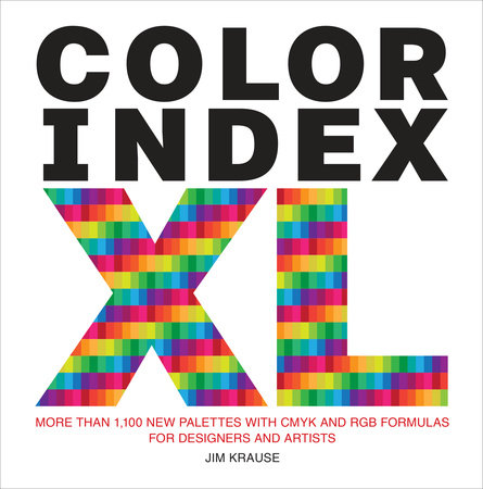
Color Index XL

More than 1,100 New Palettes with CMYK and RGB Formulas for Designers and Artists

About the Book

This updated, expanded, and oversized inspirational resource presents 1,100 color palettes, with light, bright, dark, and muted varieties for each one, making it the most expansive palette selection tool available.

Color Index XL provides aspiring designers, artists, and creative individuals working with color with an indispensable, one-stop method for reviewing and selecting current, up-to-date color palettes for their creative projects. Designer and lecturer Jim Krause's classic resource is back with a new approach that presents each group of palettes in an oversized form for easy visual review, and bleeding to the edge of the page (edge indexing) for quick access. By providing variations for each palette, Krause ensures that creatives can find the best color selection for each project's needs. This book serves as the perfect resource for teachers, students, and professionals of all kinds in the art and design space who want to stay up-to-date on the ever-evolving trends in color.
Read more
Close

Praise for Color Index XL

“In a digital realm where everything can be found online, I still prefer analog methods. Matching colors to a real printed source always ensures that what I see is exactly what I’ll get. Color Index XL will be one of those books in your library littered with post-it notes hanging out of the page edges looking like it's overdue for a good shave. And rightly so, it’s because it’s distinctly useful for the creative process, a tome of colorful insights you’ll return to over and over again for years to come. Good books aren’t meant to remain in mint condition, you’ll use this reference a lot and eventually wear it out and that as Martha says is a good thing.”
 —Von Glitschka, Creative Director of GlitschkaStudios.com
Read more
Close
Close
Excerpt

Color Index XL

INTRODUCTION 


Why a new edition of Color Index? And why now? For one thing—whether you’re talking about cars, computers, vacuum cleaners, or books—there’s always room for improvement with newer models. Also, as I’m sure you’ve noticed, tastes and fads constantly evolve when it comes to color. The palettes in this volume reflect changes in trends in the last decade or so. 

Here, I’d like to showcase four key features in Color Index XL. I think these upgrades are especially noteworthy. 

First of all, Color Index XL is a lot bigger than its pocket-size predecessors (and this is where the “XL” in the title comes from). The main advantage  of this extra-large format is that it’ll give you a much better look at the book’s palettes. As a result, you’ll have an easier time imagining how a palette’s colors will look when added to a project of your own. 

The second feature applies to the print edition of this book. As you can see, its colors go right to the edges of the book’s pages (in printer terminology, this is known as allowing colors to “bleed”). The nice thing about having this book’s palettes bleed is that you can now lay a page’s colors directly against another work of design or art for easy and direct comparison. Not only that, but the bleeding palettes in Color Index XL also make it possible to conveniently fan along the edges of its pages when you’re either brainstorming for palette ideas or looking for a specific range of colors. I think you’ll really like this feature. I know I do, and I also really like the way these multicolored pages look when the book lies closed. It’s a neat visual effect. 

The third feature is that each of the palettes in Color Index XL contains five colors (the earlier  incarnations of Color Index featured palettes with as few as two colors). Why the expanded palettes? Well, why not? After all, advances in printing and digital technology have largely done away with cost barriers that once severely limited the number of colors that designers and artists could use on a project. 

Now, given that this book’s palettes each contain five colors, you might wonder if you have to incorporate all five hues when selecting a particular palette. The answer is no. Not at all. Choose anywhere from just one to all five colors, depending on the needs of your project and the look you’re aiming for. 

And, finally, the fourth key feature of Color Index XL is that each of its palettes is shown in four versions: brighter, darker, lighter, and more muted. This is an especially practical upgrade, since it allows you to find a palette with just the right visual personality and properties. For example, you might choose brighter palettes for projects that call for feelings of extroversion and energy. Meanwhile, darker palettes could be the answer when you’re preparing backdrops for lighter headlines, text, or graphics. You might apply lighter palettes to backdrops that are meant to sit beneath darker visual elements, or use muted palettes to generate feelings of sophistication or restraint. 

All in all, these features should make Color Index XL an even more timely, practical, and idea-expanding creative tool than any of my previous Color Index books.

About the Author

Jim Krause
JIM KRAUSE has been a graphic designer since the early 1980s. Over the years, he has worked for clients large and small, including Microsoft, Levi Strauss, and Seattle public schools. He began writing books about design and creativity in 1999 and has written one a year since that time, having published approximately 15 books. More by Jim Krause
Decorative Carat