
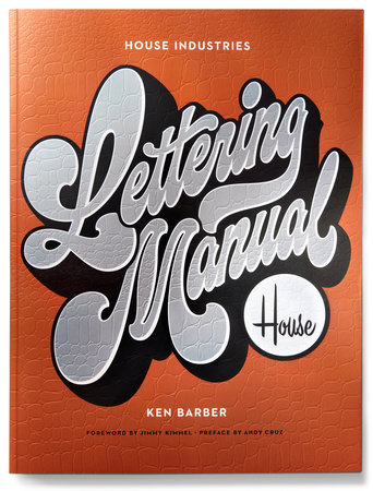
House Industries Lettering Manual
Ken Barber
Paperback
August 25, 2020 | ISBN 9781984859594
AmazonBarnes & NobleBooks A MillionBookshop.orgHudson BooksellersPowell'sTargetWalmart
About the Book
Learn the history and techniques of hand lettering from a renowned design studio. This practical and visual guide features exercises, case studies, and typographic models for letter styles such as serif, sans serif, brush, and script.
Known throughout the world for its eclectic typeface collections and far-reaching creative exploits, from fonts and fashion to ceramics and space technology, House Industries has been a standard bearer for American graphic design for more than twenty-five years. The House Industries Lettering Manual is an accessible hands-on guide to drawing letters from Ken Barber, House's head letterer and type design director.
Modeled after a series of sold-out lettering workshops that Ken has conducted around the world, this highly illustrated handbook outlines the history of lettering, various methods and techniques, common letter styles, and best practices for getting paid for your work. This handy how-to guide also provides lettering models to help sharpen your drawing skills and offer departure points for further experimentation. Designed by House Industries and including copious examples, exercises, and opportunities to practice what you've learned, plus photographs of works-in-progress and finished projects, this instructive and visually engaging book will help you master the dynamic art of lettering, whether you're a budding artist or an experienced designer.
Read more
Close

